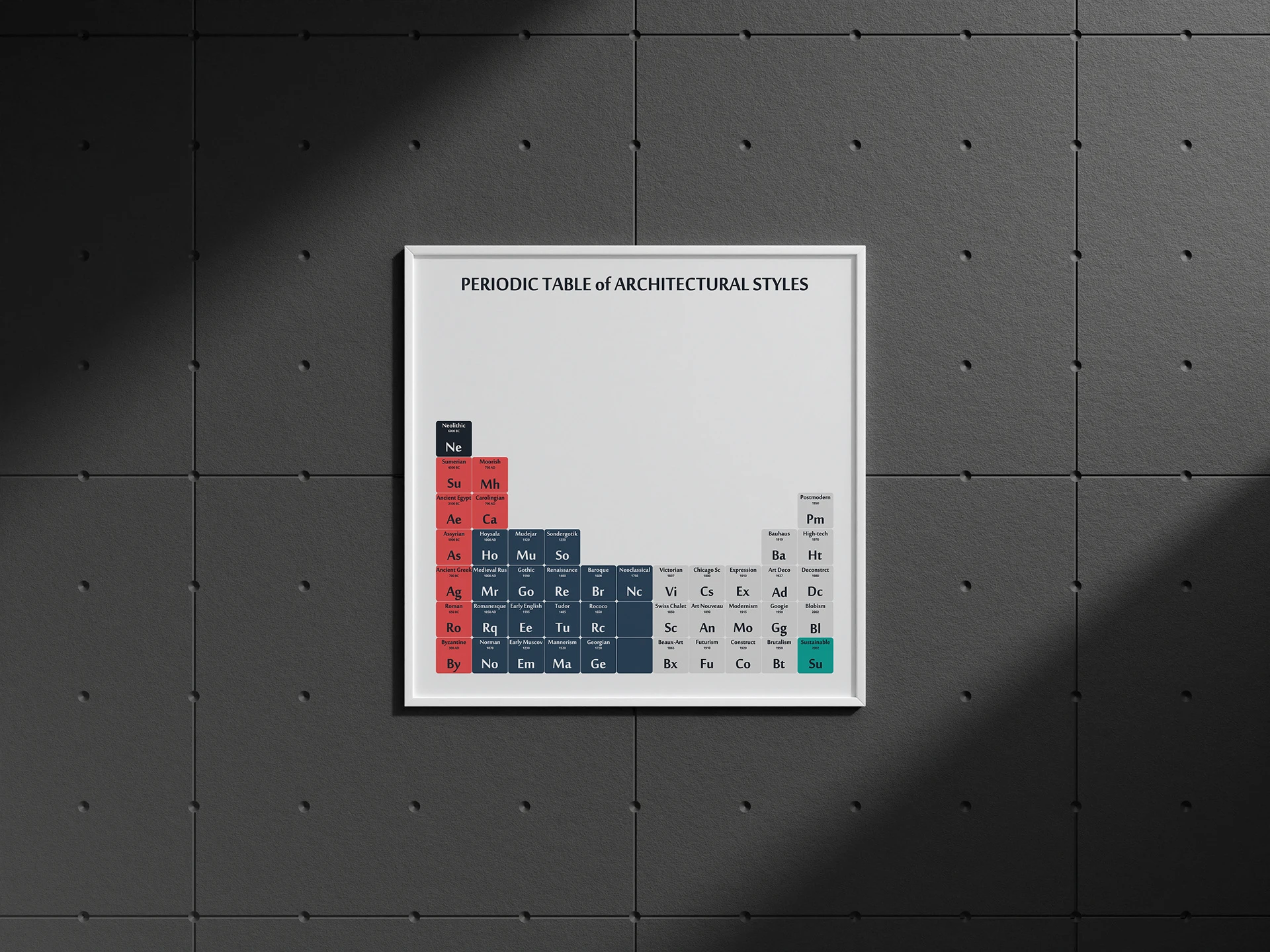
DATA: Periodic Table of Architectural Styles
Architecture doesn't exist in isolation. Every style emerges from what came before it - borrowing, reacting, evolving. This project maps the entire timeline of architectural history into a single visual system inspired by the most iconic organizational tool in science: the periodic table.
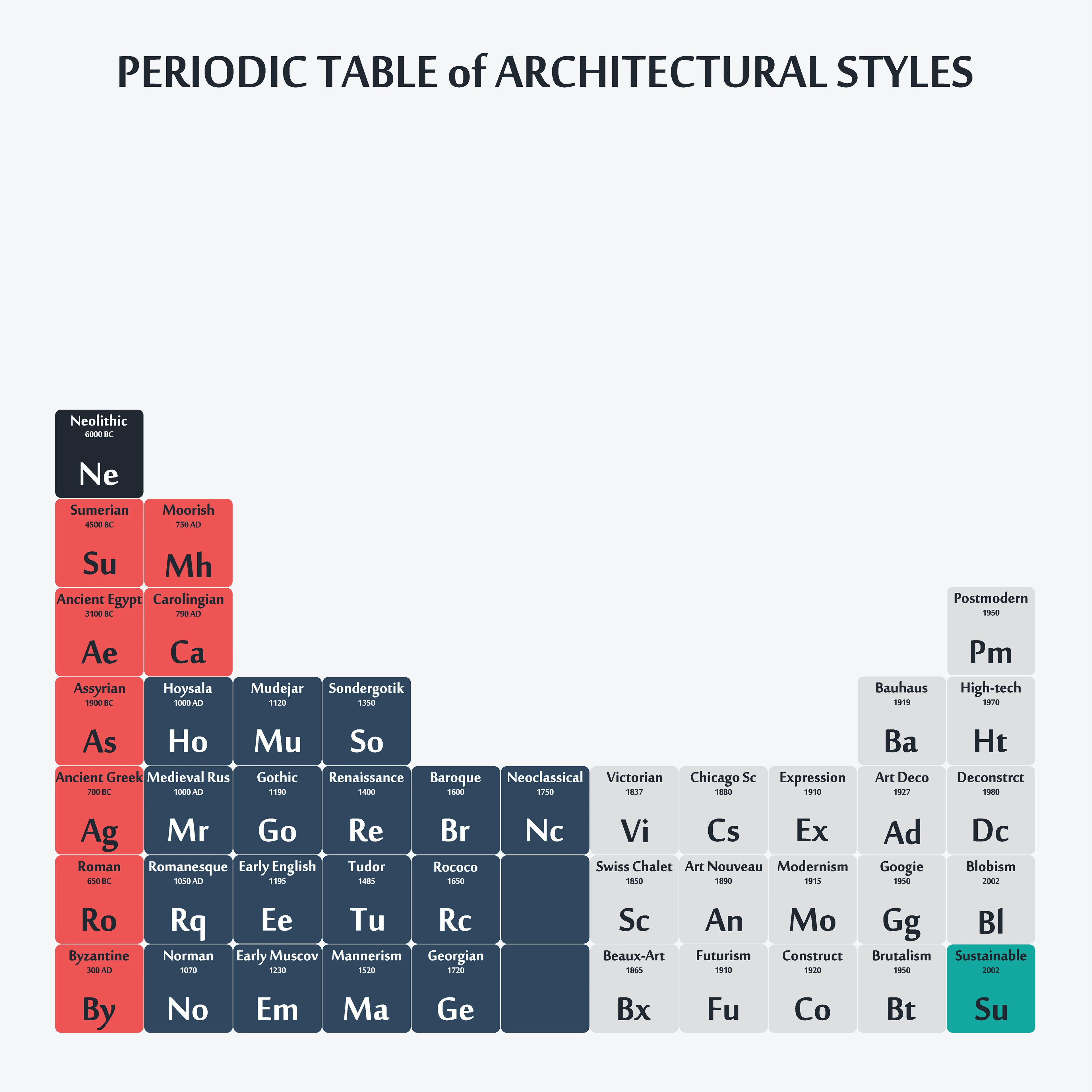
Each "element" represents a distinct architectural style, assigned a two-letter symbol, a date of origin, and a color group based on its era. The result is a reference chart that is both functional and decorative - designed to be read as data, or simply admired as a poster.
This project sits at the intersection of information design and architectural history. The challenge was not research - it was reduction. Deciding which styles deserve a tile, which abbreviation feels right, and how to create visual hierarchy without losing the playfulness of the periodic table metaphor.
The System
Organized chronologically from top-left to bottom-right, loosely following the logic of the original periodic table - where position carries meaning. Five color groups define the broad eras: Dark Charcoal (Prehistoric & Ancient), Coral Red (Ancient & Classical), Deep Navy (Medieval to Early Modern), Light Grey (Industrial Age to Contemporary), and Teal (Sustainable Architecture, 2002–present).
The Elements
Each tile follows the same visual grammar: full style name at top, approximate year or century of origin below, and the two-letter abbreviation as the dominant visual element - echoing the atomic symbol convention. From Ne (Neolithic, 6000 BC) to Su (Sustainable, 2002).
Reading the Table
Horizontal rows suggest loose stylistic or regional families. Vertical proximity implies chronological succession. The gaps - where no tile exists - are intentional: not every era produced a dominant global style.